
Bruce Goff: Material Worlds
Unlike other architects, Bruce Goff did not have a signature style, which seems fitting since his work is difficult to categorize. He was also a one-of-kind person with a wide range of interests, or sometimes very specific ones as recently shared by Zach Mortice for Bloomberg’s CityLab:
“Toward the end of his career in the late 1970s, the architect Bruce Goff lived with his mother and a tuxedo-hued cat named Chiaroscuro in the small city of Tyler, Texas. He stopped work promptly at 4:30 p.m. each day to watch Star Trek. His favorite meal was roast beef and potatoes.”
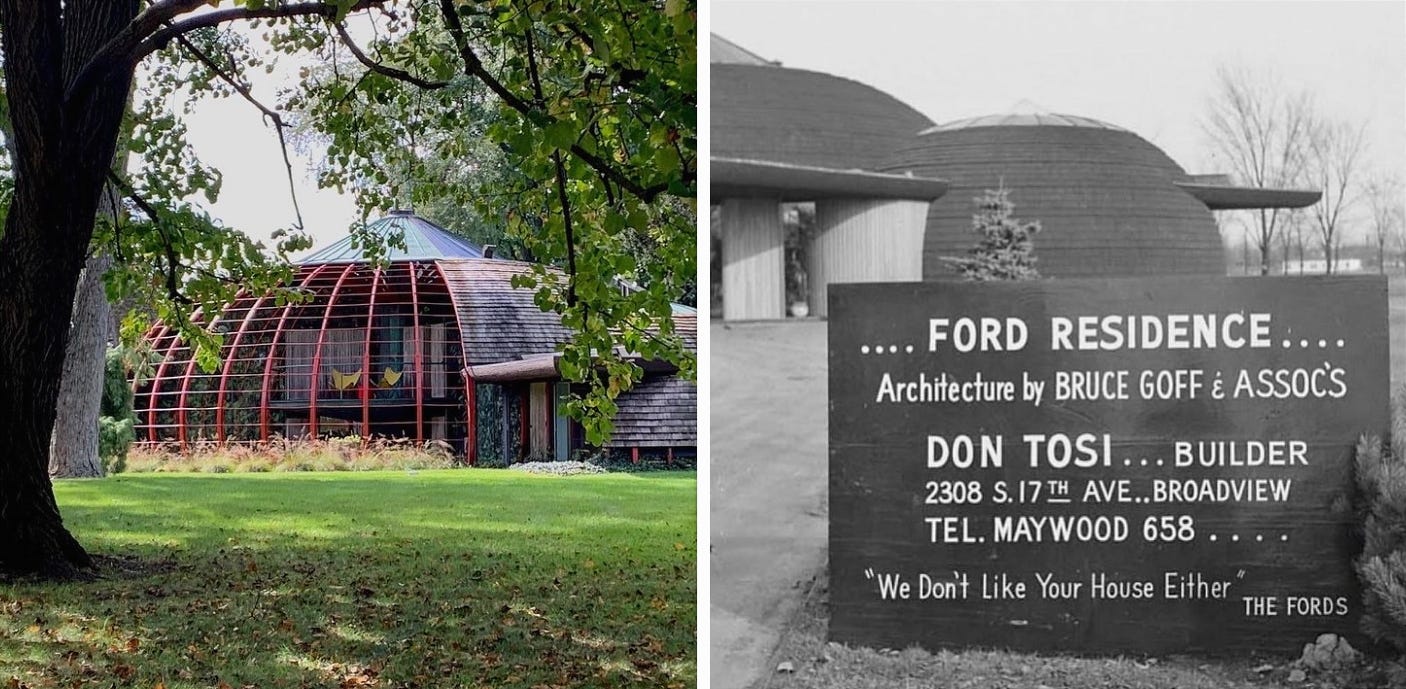
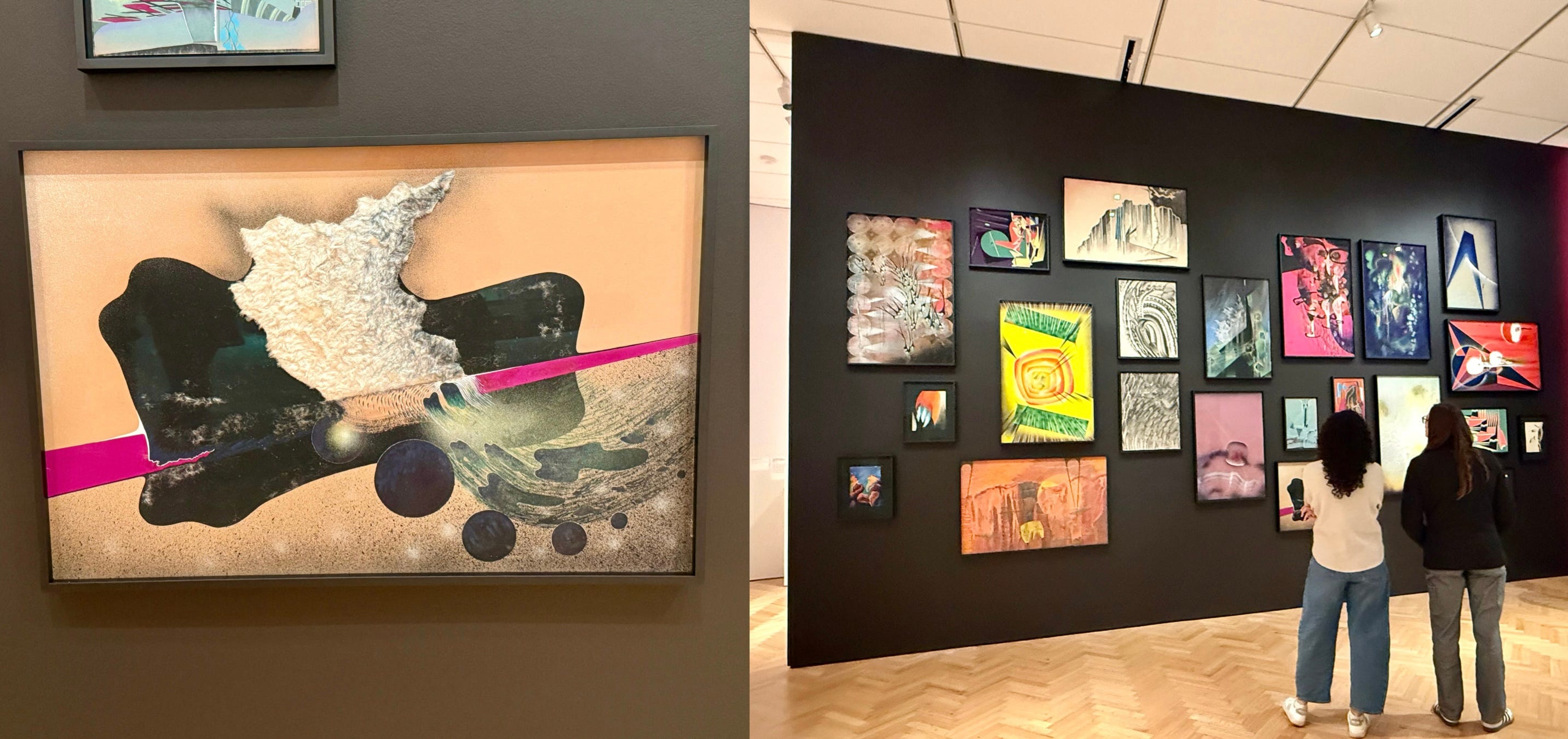
I’ve never been to Oklahoma, where Goff lived most of his life, but as an architecture geek, I have made it a point to personally see all of his work here in the Chicagoland area, including the Ford House in Aurora, as seen in the above photos. What I learned from the Art Institute’s retrospective is that Goff really loved stuff! He incorporated recycled materials, glass tubes, pieces of coal and rope, chunks of unprocessed blue-green glass cullets, corrugated metal, gilded zebrawood, and glass ashtrays (he put them inside walls and doors) in his unconventional architectural designs. He even used synthetic fur in his paintings. There are no words to describe someone who was so imaginative, and I found myself feeling the same way after seeing “Bruce Goff: Material Worlds,” curated by Alison Fisher and Craig Lee. Don’t get me wrong, I am glad I saw it. But I felt that something was missing, even though I wasn’t exactly sure what. Could that have been the intention?
I have a confession to make: I have not been to the Art Institute of Chicago in years. And if my memory is correct, the last time I specifically went to see a special exhibit was “Picasso and Chicago” in 2013. So, let’s just say, it’s been awhile since I last visited. And wow, the changes were evident from the very beginning when I lined up to wait for the doors to open at 11 a.m. Maybe because I briefly attended Columbia College just down the street and remember when the Art Institute had suggested ticket prices and was open every day with longer hours, I felt a bit sad that the museum is more limited and more expensive for people to physically experience art (especially when we need it now more than ever). But I suppose this is the post-pandemic world I have to accept. Or perhaps I’m nostalgic for the days when I (and others) could pop in for brief visits, spending just a couple of dollars.
Anyway, let’s start with the Michigan Avenue entrance. In a recent puff piece by WBEZ, museum president and director James Rondeau, who hired the Spanish firm Barozzi Veiga in 2017, described their redesign of the Michigan Avenue Allerton Lobby as “much more open, much more welcoming and much brighter.” I find that statement incredibly hilarious, considering it’s the complete opposite. It now has the appearance and feeling of a mausoleum.
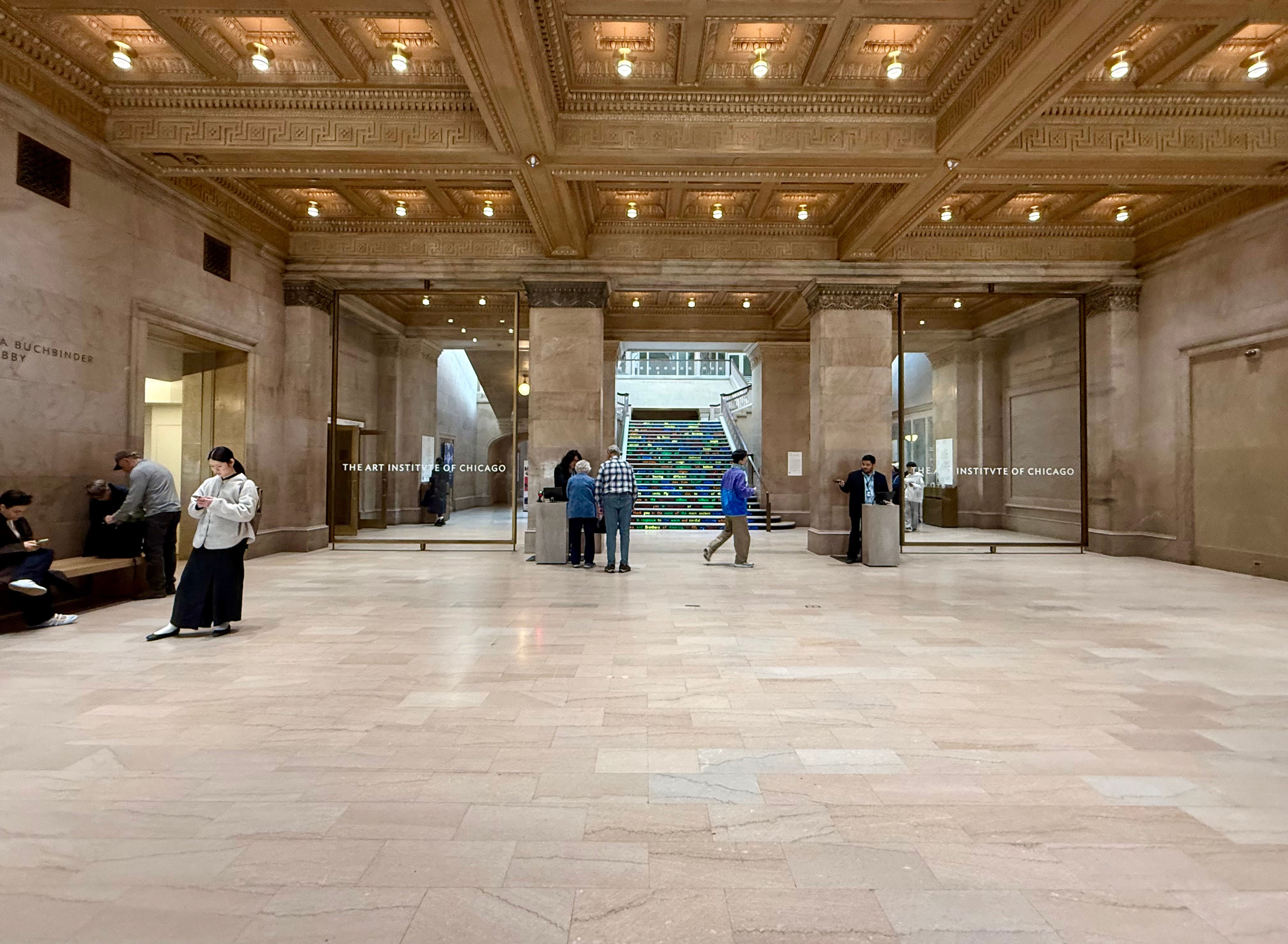
The Beaux-Arts space was restored by architect John Vinci in the 1980s, who installed an illuminated center section in the coffered ceiling to evoke the original opening present when the museum first opened in 1893. A marble welcome desk, staffed by volunteers and employees, was added, along with the installation of custom Edison light fixtures in the bronze rosettes, which were based on original designs. The desk is gone. In its place is now an alienating, inhospitable space where you are “scanned in” rather than being welcomed. Visitors are left to navigate on their own, unsure of what to do and where to go. While I understand this is likely intended for crowd control to prevent people from lingering, the overall atmosphere reminded me of so many public places in the U.S. where seating and human interaction have been eliminated. As a visitor, it made me feel somber and cold.
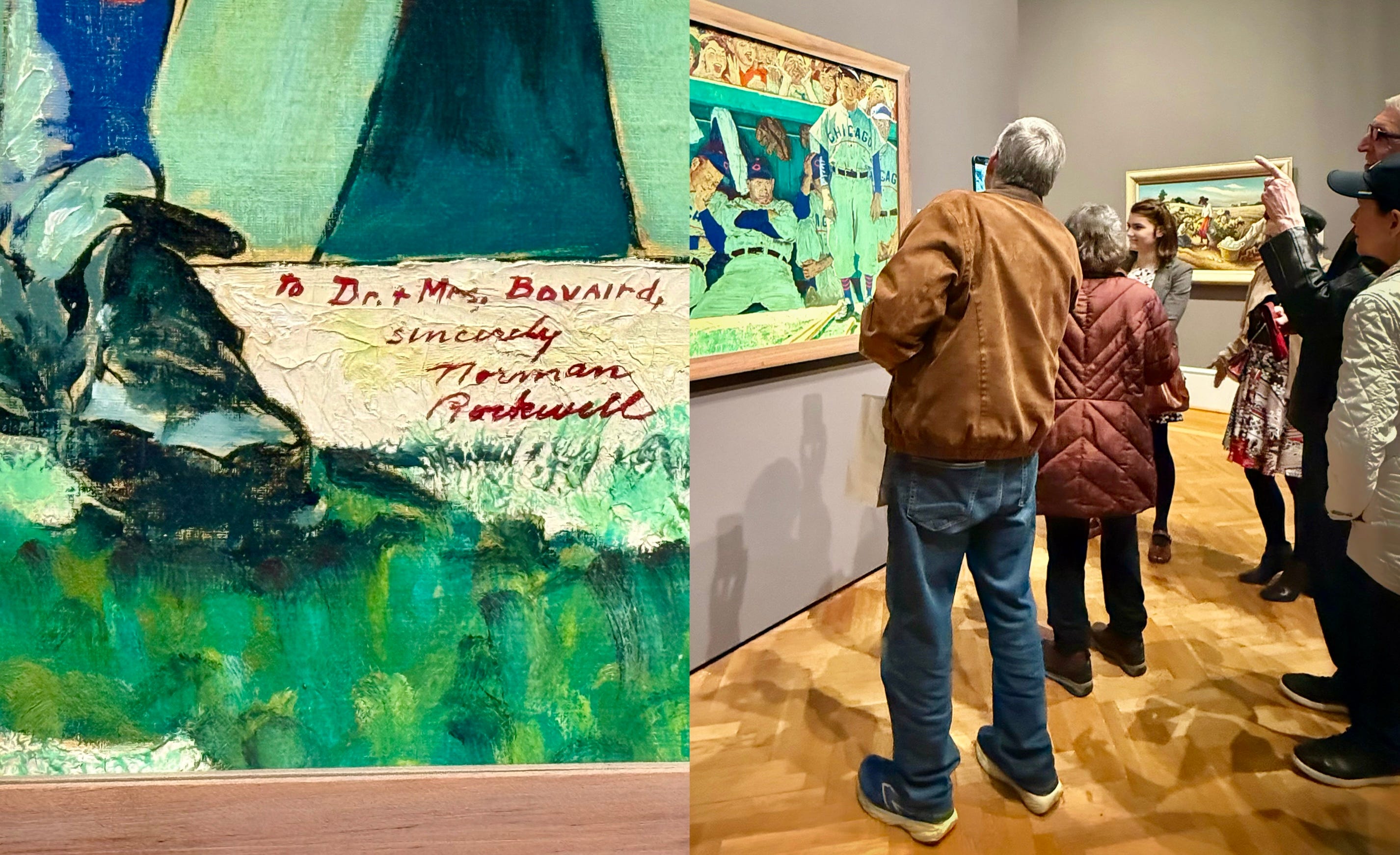
Even though I had a limited amount of time, I still wanted to check out some of my favorites before seeing the “Bruce Goff: Material Worlds” retrospective. After all, it had been awhile since my last visit. In that first hour I checked off the Thorne Miniature Rooms, Edward Hopper’s Nighthawks, and the Monets and Van Goghs. American Gothic was on loan, which elicited some loud, negative reactions from other visitors. However, I got to see people gawking at the museum’s latest acquisition, The Dugout, a 1948 painting by Norman Rockwell, that depicts the Chicago Cubs enduring heckles from opposing fans in Boston. While I walked through the galleries, the museum was buzzing with people. With the rise of online culture, where everyone seems to spend their time endlessly scrolling or “living” in a digital world full of algorithms, it made me to happy to see that people had actually made the pilgrimage to experience art in person at a “real place.”
Probably because I have a (useless) degree in museum studies, I can’t help but notice how other people experience physical spaces and interact with art on display. What stood out to me about the Bruce Goff exhibit was that visitors seemed confused about how to find it in the first place (I even helped direct people myself), as you have to go through the Arts of China, Japan, and Korea galleries to get to Regenstein Hall. Perhaps the missing welcome desk would have helped? Or I suppose that is just a problem with the building itself? Speaking of buildings, I have always thought of Bruce Goff primarily as an architect. However, the main focus of this exhibit instead aimed to capture him fully as a collector, painter, teacher, and even musician. Goff the artist, and even Frank Lloyd Wright to some extent, overshadowed Goff the architect. I’m not sure if this is a criticism, as this seems to be intention of the exhibit.
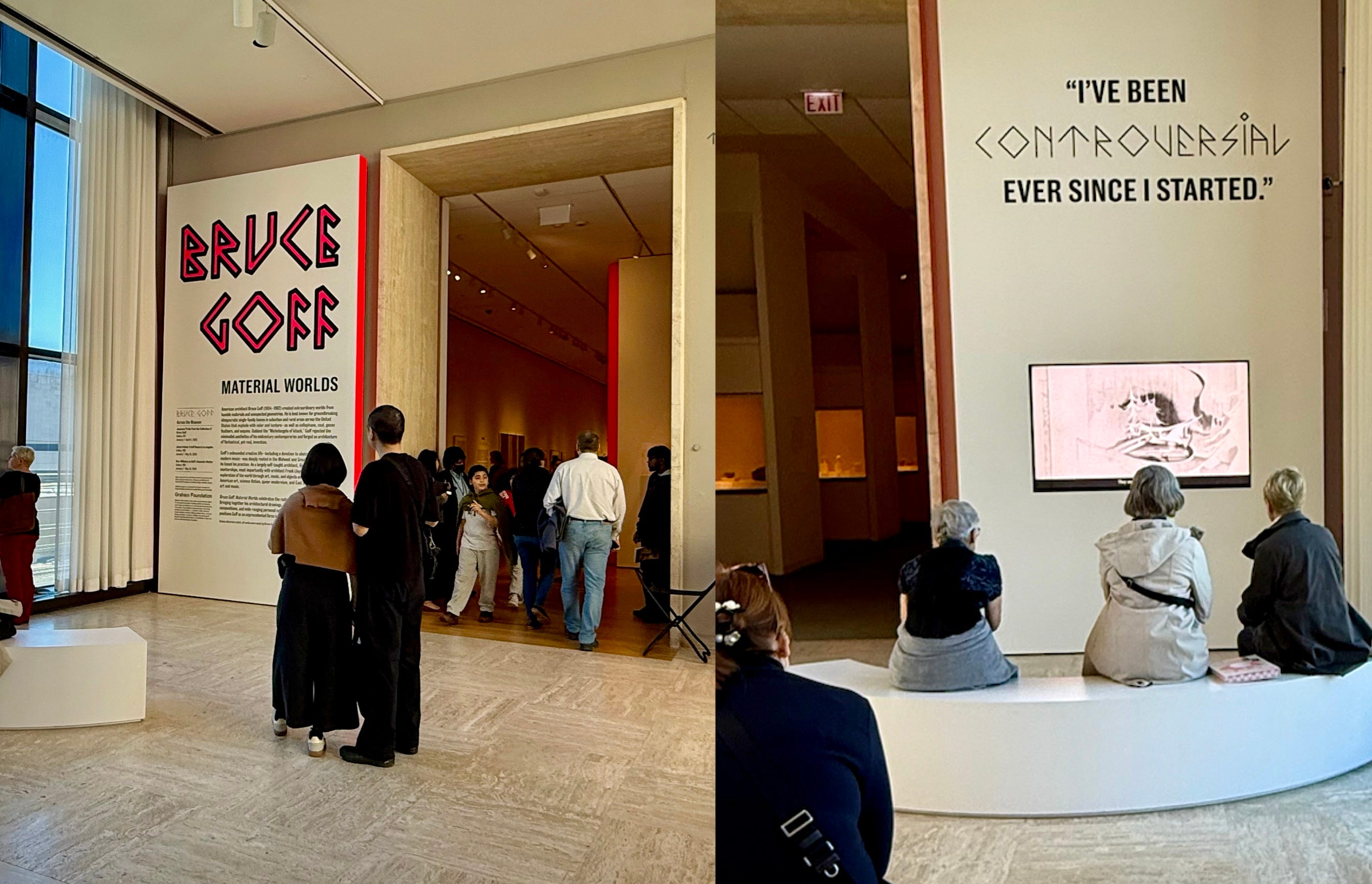
A guard directed you to the right, where visitors were introduced to Goff, not as an architect, but simply by viewing a collection of “his stuff” in glass cases. I would have preferred a clearer introduction at the beginning, especially considering he is not very well known to a general audience. Was that really the right place to start? Now that I think about it, perhaps the overall theme of this exhibit was that Goff loved to collect and incorporate “stuff” into his designs so maybe this was the way to go. From shag rug samples to mirrored balls, it makes sense why Charles Jencks described him as “the Michelangelo of kitsch.” Yet this exhibit attempted to move beyond that potentially unfair assessment and portray him as a real person. Did they succeed? I’m not entirely sure as I was already familiar with him. Hopefully, people will be curious enough to learn more.
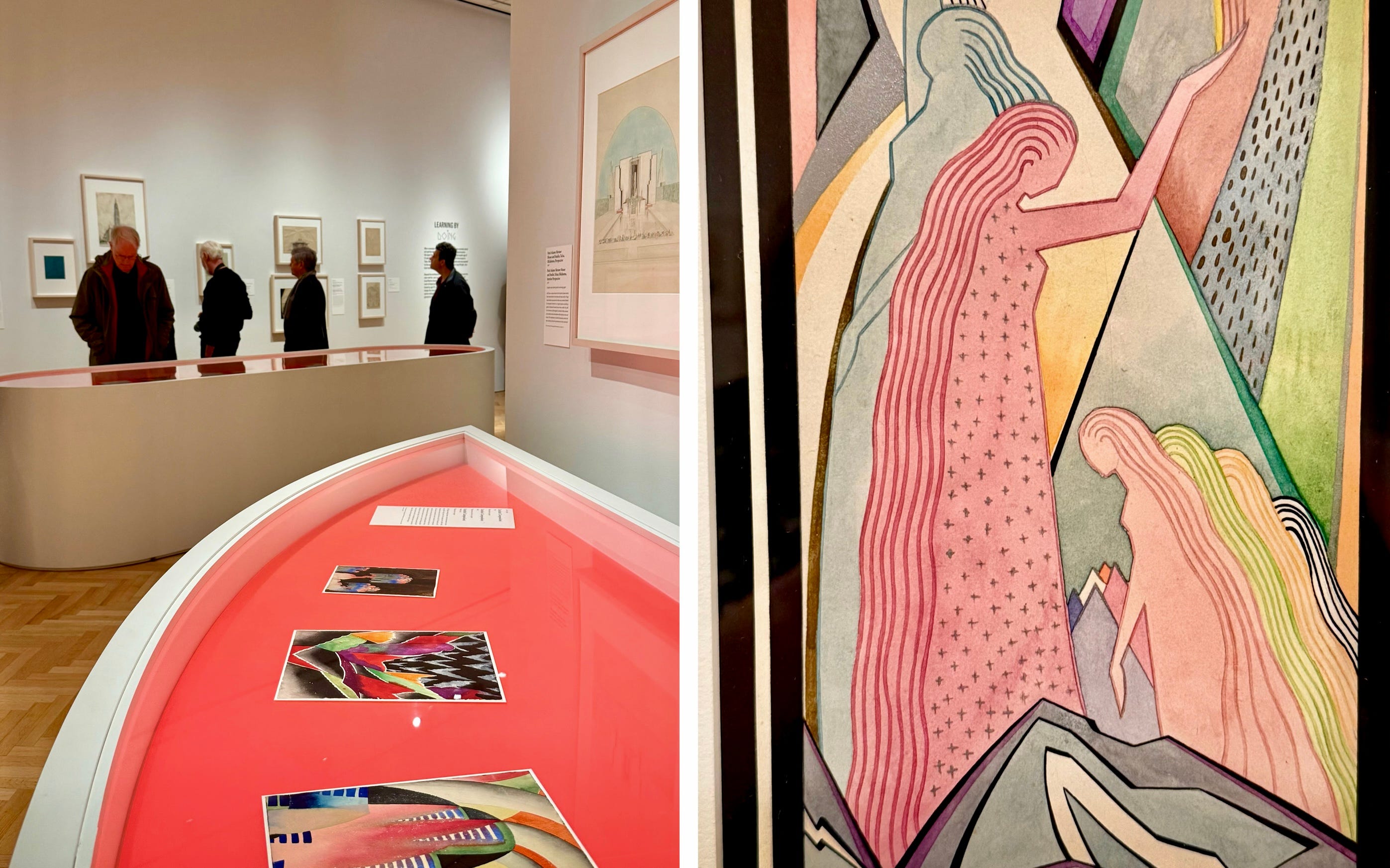
I remember when I was in graduate school, one of our museology professors said that the majority of visitors do not read text labels in an exhibit. That was over twenty years ago, before smart phones took over our lives. I noticed some of the older guests were definitely taking the time to read descriptions. Just as I was about to discount the younger people that were part of a school group, I overheard one ask, “Did he do all this?” The other student replied, “No, I think other people did, like that over there,” as she pointed to some artwork by Olinka Hrdy, who collaborated with Goff on the Riverside Studio and Brady Theater, both located in Tulsa.
While it is important to recognize the individuals Goff worked alongside (and who influenced him) during his career, I did have an issue with the overemphasis of Frank Lloyd Wright. Can there be at least one architecture exhibit that does not mention Frank? I guess not. I mean, I get it. Goff was heavily influenced by Wright and Louis Sullivan after he corresponded with both men, who encouraged the then-teenager to skip M.I.T. and continue practicing architecture with the Tulsa architectural firm of Rush, Endacott and Rush, where he’d apprenticed at the age of 12 and later became partner in 1930. It might be hard to believe, but Goff was continuing, as well as reinterpreting, Wright and Sullivan’s concept of organic expression. I would have liked to see more of that explored in the exhibit. In 1932, Goff wrote a poem titled About Absolute Art:
“It is time to recognize our natural human-divinity
to shape from and with this
organically
our lives
our work
It is time to be free
naturally natural
CREATE ABSOLUTE ART”
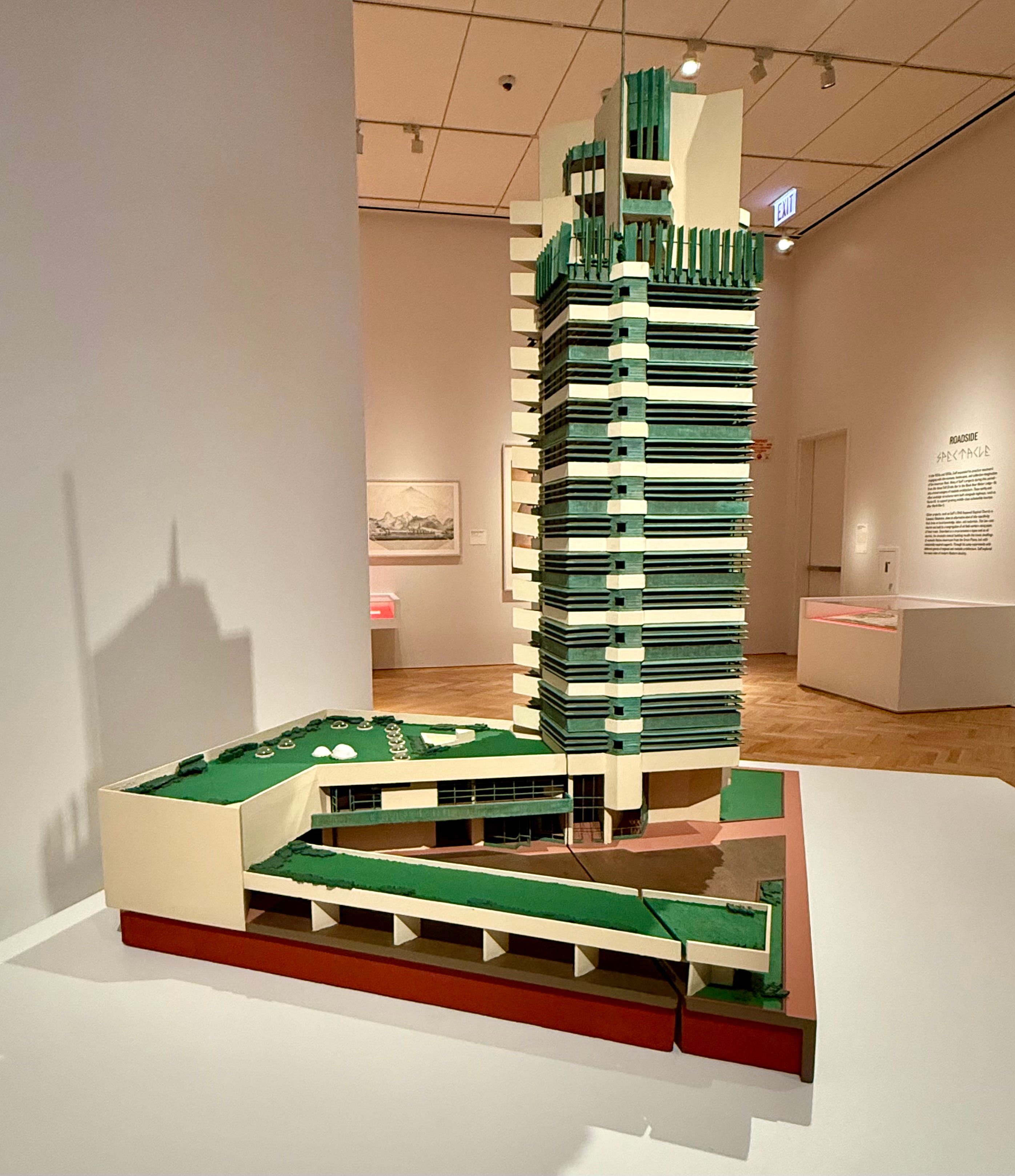
Goff played an instrumental role in helping Wright secure the commission to design the headquarters for the copper-clad H.C. Price oil-pipe company in Bartlesville, Oklahoma, with construction beginning in 1952. It was Wright’s only skyscraper. Goff, who moved his home and studio into the tower in the mid-1950s, was the only person to fulfill the live-work units that Wright had envisioned for the mixed-used building, which is now being converted into 20 residences and 20 hotel rooms.
In 1934, Goff moved to Chicago to work briefly for sculptor Alfonso Iannelli, who he had first met during the 1926 construction of Barry Byrne's Parish of Christ the King in Tulsa. Considering that this retrospective was on display in Chicago, I wish there had been more focus on his time living and working in the city. Ruth Van Sickle Ford was President and Director of the Chicago Academy of Fine Arts, where Goff began teaching part-time during his first year in the city. Fifteen years later, she hired her former teacher to design her famous dome-shaped house, formed by Quonset hut ribs. I was hoping to learn more about Goff’s other artistic connections in Chicago.
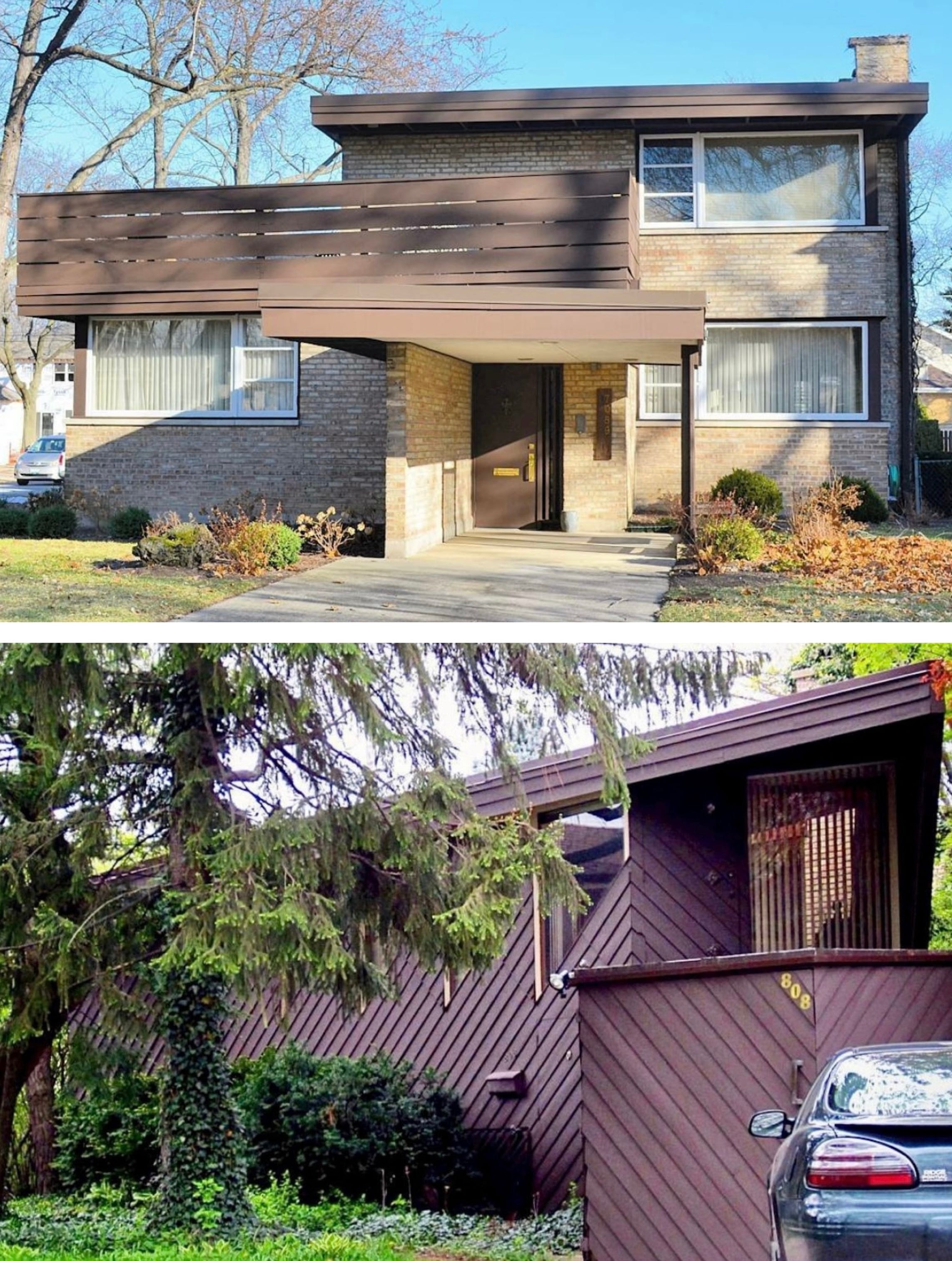
Where was Charles Turzak? The modernist woodblock artist commissioned Goff to design a Chicago home in 1938-39 that was such a shock to neighbors, they thought the residence was a retail building. A couple of years later, Goff created a triangular home for local art teacher Helen Unseth in nearby Park Ridge. I would have liked to learn more about these early clients. I appreciate the effort to be more open about Goff’s sexuality while he lived and worked in Chicago, a place where he could find a more accepting community compared to Tulsa. He lived with poet Richard San Jule, who, like Goff was married to a woman. They had met back in Tulsa and shared a life together, first in Park Ridge, and later at 1515 Howard Street in Chicago’s Rogers Park through much of the 1930s and 40s until San Jule’s untimely death from an embolism following surgery in December 1945.
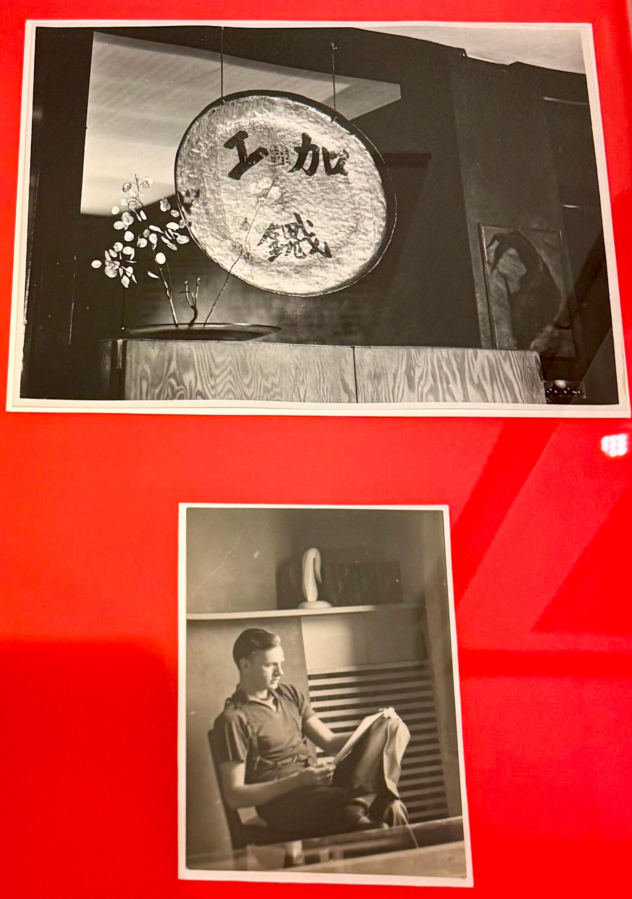
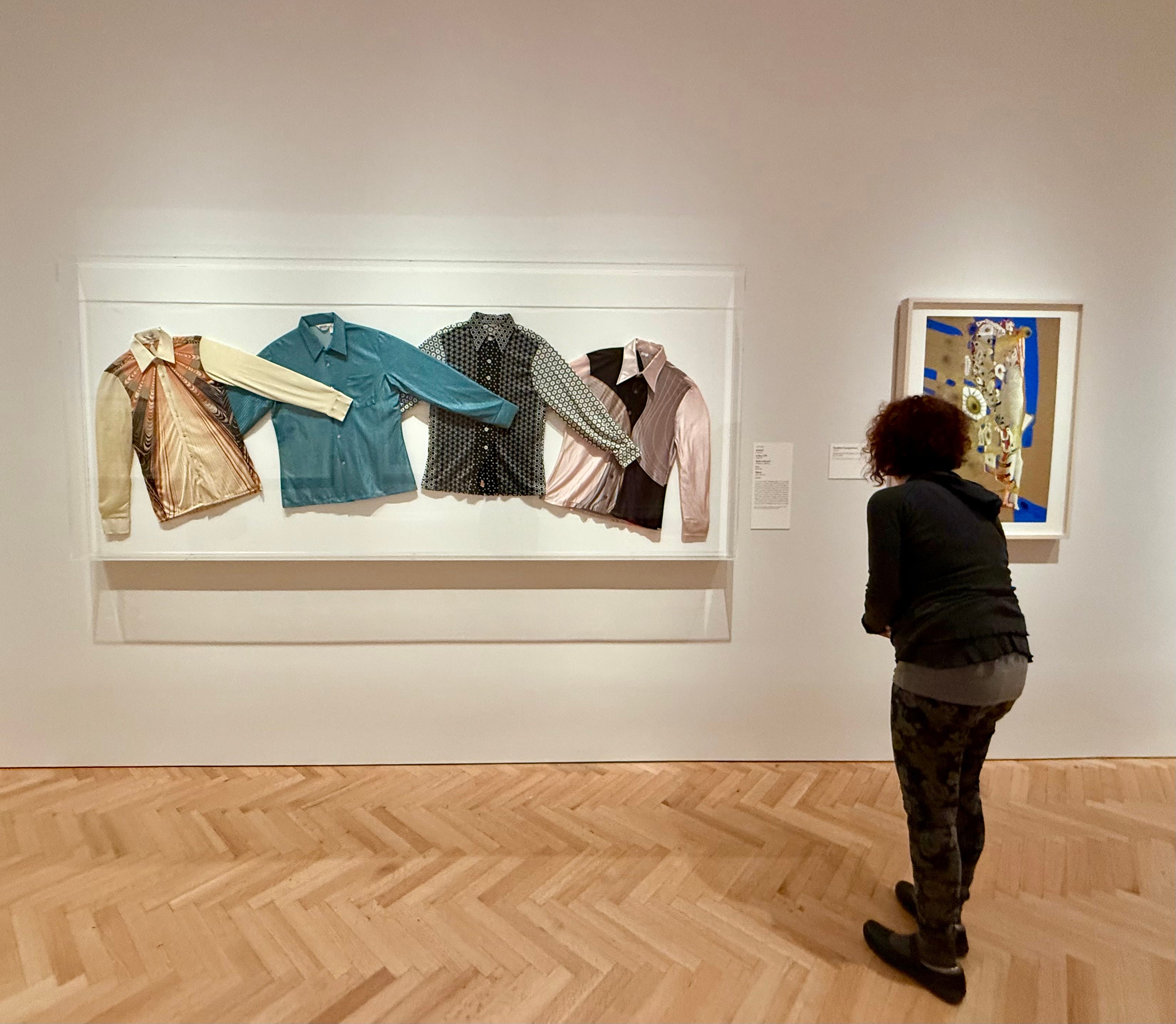
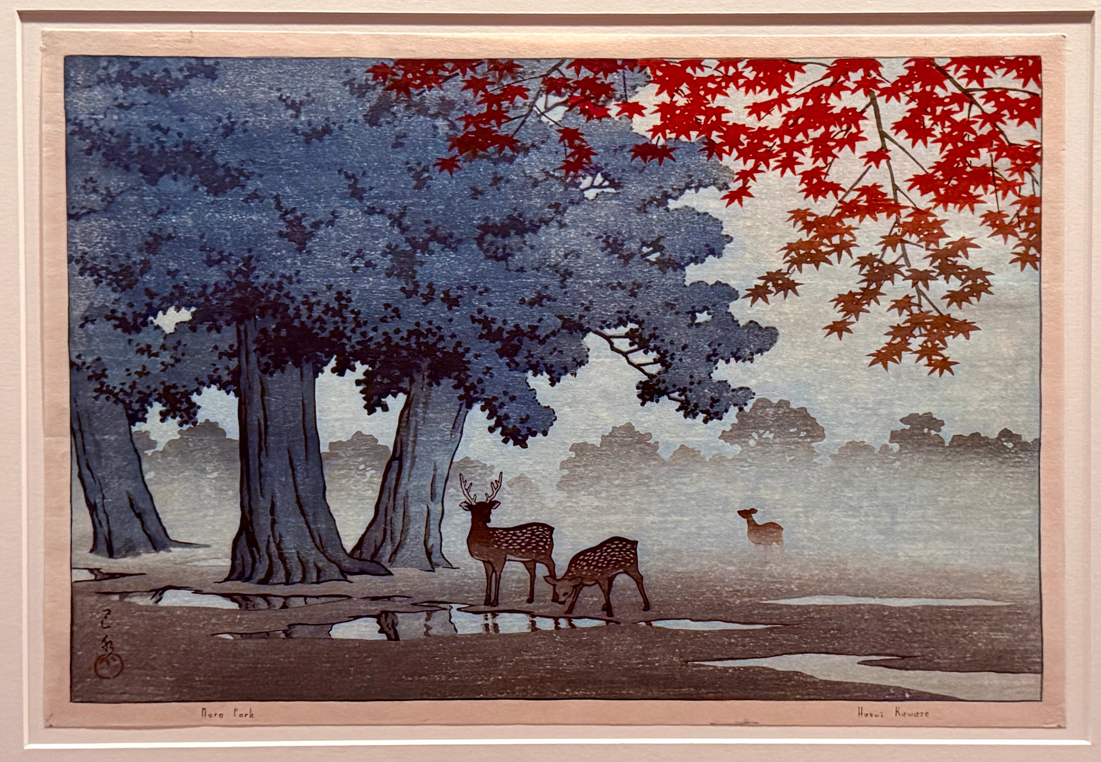
There was an attempt to present Goff’s life chronologically, but as I already said, it felt more like a mishmash of various “stuff” related to his life and work. This could have been improved by creating more clearly defined and cohesive sections with more detailed information to go along with it. Sorry but not everyone is going to read the nearly 300-page catalog. Was it the correct decision to display Goff’s keys and shirts right next to his work? Does it take away from his accomplishments? Or is this what he would have wanted? I wish I had more time to see the other related exhibitions, including photographer Janna Ireland’s A Goff House in Los Angeles. Though I briefly took a peek at Goff’s own Japanese art print collection (he owned 800 plus), which he not only displayed at his home but also showed to his architecture students.
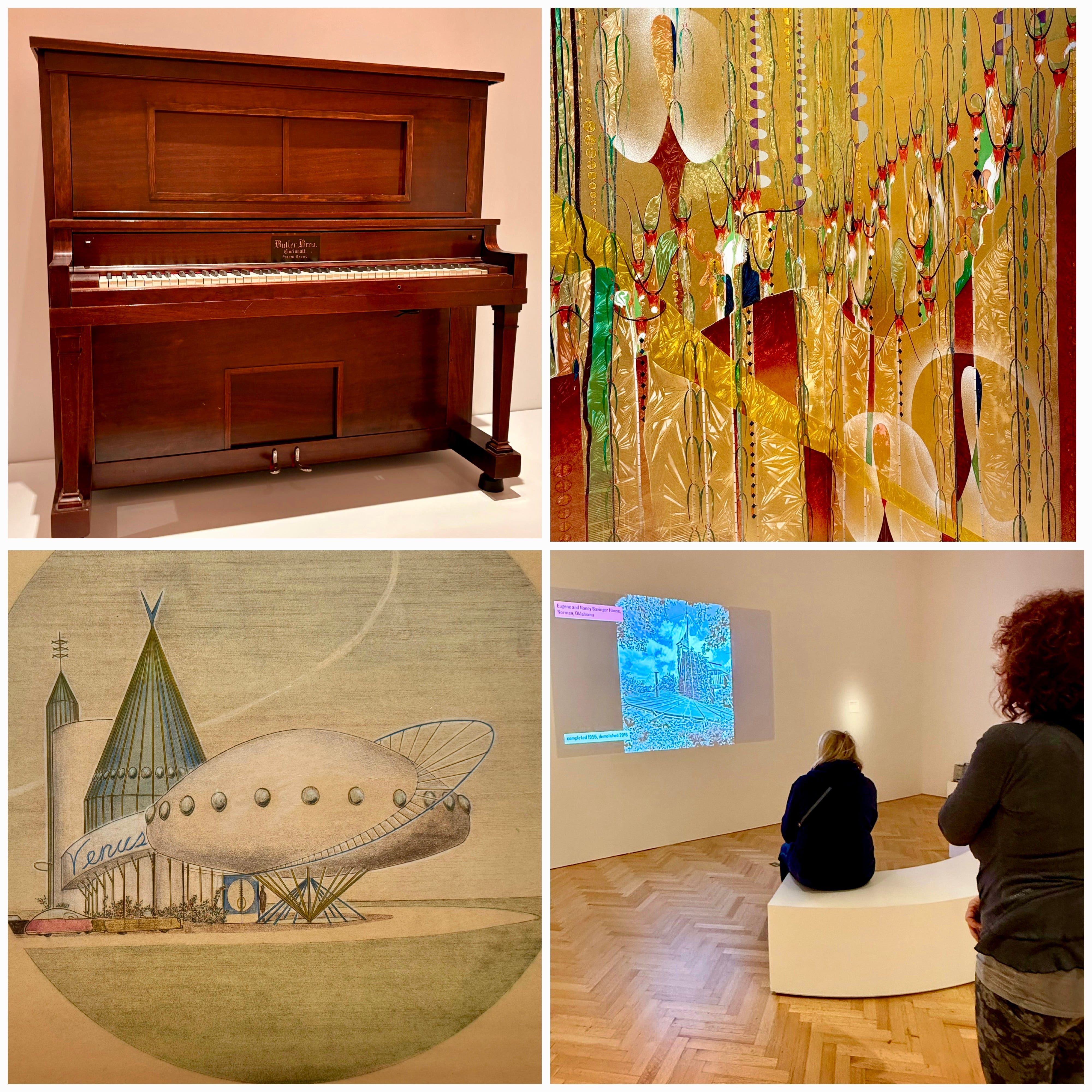
I admit that I probably would not have enjoyed Material Worlds as much if the architectural slide show had not been included. It appeared to have an impact on visitors as a number of them took the time to watch it while I was there, although I don’t know if they came away from the exhibit with a better understanding of his work as an architect. I wish this interactive display had been placed near the beginning, or right at the end. As visitors were seeing selected drawings of Goff’s built (and numerous unbuilt) works, the slide show helped provide context, yet I’m not sure placing it randomly in the exhibit was the right choice? I also liked the use (and sound) of the player piano, which actually “performed” one of Goff’s compositions. He painstakingly hand-punched the holes himself directly with a hobby knife, triggering the individual notes on the rolls that go inside the piano. The piano and slide show were definitely highlights for me.
I was looking forward to the exhibit and admit I was initially disappointed after seeing it, until I read that it was somewhat of a sequel to the 1995 installation, “The Architecture of Bruce Goff: Design for the Continuous Present,” which focused exclusively on his architecture. With a large archival collection that includes 266 boxes (and much more), I understand why the museum wanted to showcase more of Goff beyond his life as an architect. Yet I’m not sure they approached it the right way. Or should I say the clearest way. But how can they, given that Goff was such a complex figure whose work is kind of all over the place? I’m glad I saw the exhibit, though I can’t quite put into words the frustration I felt afterward. Perhaps that was the point? Goff’s life and work are difficult to encapsulate. If anything, this exhibit, which is open through March 29th, helps get his name out there and increase his overall visibility to the general public. And that’s a good thing.
Dear Rachel,
As an art blogger who occasionally gets into architecture, I appreciate your architectural reviews. I have not seen the Bruce Goff exhibition yet, but hope to get there -- will reread this review before I go. Many people agree that there's an unwelcoming feeling coming from the Art Institute today, and I personally don't understand the new layout of paintings. The volunteers at the help desk should return; they were a big help. The Art Institute took out all its monumental sculpture in the Roger McCormick Gallery, a big loss. We have a petition to return the Lorado Taft statue back to display in the museum. Would you consider signing it?https://www.change.org/p/return-lorado-taft-s-the-solitude-of-the-soul-for-display-at-the-art-institute-of-chicago
Rachel, I agree with your review, having had much the same reaction after taking it in. I left feeling unsatisfied thinking that there was an aimlessness to the exhibit. Also, regarding the entrance, my first reaction was that it was a work in progress. As a frequent visitor I can’t help but feel that the AIC has lost its grandeur.